Users are accessing your site via their mobile devices now more than ever. Paypal recently announced at this year’s Arizona World Usability Day that 25% of their users are accessing the company’s website on their iPhones, iPads, Android phones and other mobile gadgets. That is a huge number of users, one you probably see echoed in your own site’s analytics, which is why Paypal embarked on a full mobile-first site redesign.
Google Search Results and Mobile-Friendly Site Design
Google announced that they are tagging sites that are mobile friendly which could affect your SEO rankings.
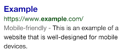
We see these labels as a first step in helping mobile users to have a better mobile web experience. We are also experimenting with using the mobile-friendly criteria as a ranking signal.
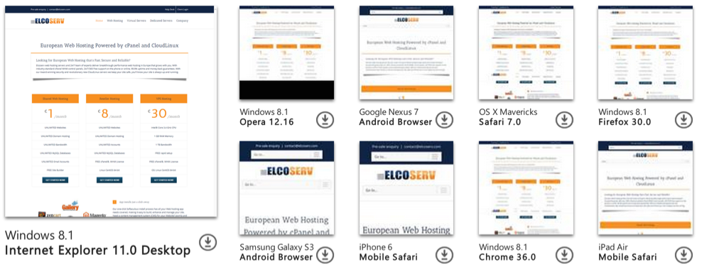
According to our own statistics 34% of all visitors are accessing from mobile devices. Here is a screenshot from Google Analytics:

Does Your Site Pass the Tests?
If you want to make sure that your page meets the mobile-friendly criteria:
- Check your pages with Google’s Mobile-Friendly Test
- Read Google’s updated documentation on their Webmasters Mobile Guide on how to create and improve your mobile site
- See the Mobile usability report in Google Webmaster Tools, which highlights major mobile usability issues across your entire site, not just one page
- If your site is running on a CMS (Content Management System) like WordPress, Joomla or Drupal you can check out Google’s How-To Guide for Third-Party Software to see some tips on updating to a mobile-friendly template.